Sunday, July 20, 2014

On the instructional sensitivity of computer-aided design logs

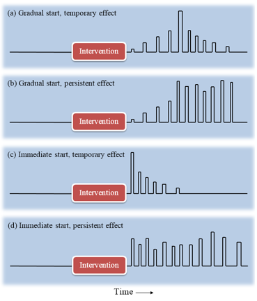
Figure 1: Hypothetical student responses to an intervention.
In the fourth issue this year, the International Journal of Engineering Education published our 19-page-long paper on the instructional sensitivity of computer-aided design (CAD) logs. This study was based on our Energy3D software, which supports students to learn science and engineering concepts and skills through creating sustainable buildings using a variety of built-in design and analysis tools related to Earth science, heat transfer, and solar energy. This paper proposed an innovative approach of using response functions -- a concept borrowed from electrical engineering -- to measure instructional sensitivity from data logs (Figure 1).

Many researchers are interested in studying what students learn through complex engineering design projects. CAD logs provide fine-grained empirical data of student activities for assessing learning in engineering design projects. However, the instructional sensitivity of CAD logs, which describes how students respond to interventions with CAD actions, has never been examined, to the best of our knowledge.
Figure 2. An indicator of statistical reliability.

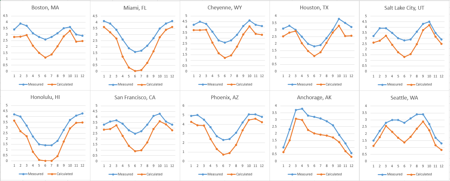
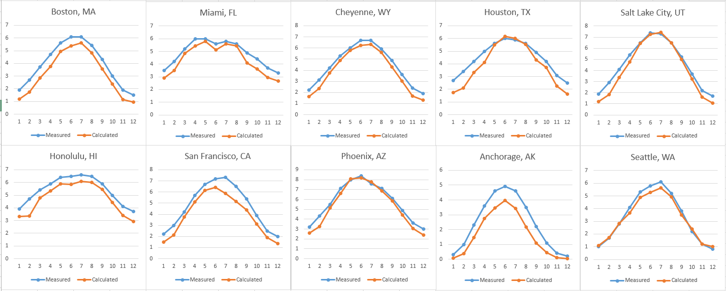
For the logs to be used as reliable data sources for assessments, they must be instructionally sensitive. Our paper reports the results of our systematic research on this important topic. To guide the research, we first propose a theoretical framework for computer-based assessments based on signal processing. This framework views assessments as detecting signals from the noisy background often present in large temporal learner datasets due to many uncontrollable factors and events in learning processes. To measure instructional sensitivity, we analyzed nearly 900 megabytes of process data logged by Energy3D as collections of time series. These time-varying data were gathered from 65 high school students who solved a solar urban design challenge using Energy3D in seven class periods, with an intervention occurred in the middle of their design projects.

Our analyses of these data show that the occurrence of the design actions unrelated to the intervention were not affected by it, whereas the occurrence of the design actions that the intervention targeted reveals a continuum of reactions ranging from no response to strong response (Figure 2). From the temporal patterns of these student responses, persistent effect and temporary effect (with different decay rates) were identified. Students’ electronic notes taken during the design processes were used to validate their learning trajectories. These results show that an intervention occurring outside a CAD tool can leave a detectable trace in the CAD logs, suggesting that the logs can be used to quantitatively determine how effective an intervention has been for each individual student during an engineering design project.

Wednesday, July 16, 2014

Accurate prediction of solar radiation using Energy3D: Part II

About a week ago, I reported our progress in modeling worldwide solar radiation with our Energy3D software. While our calculated insolation data for a horizontal surface agreed quite well with the data provided by the National Solar Radiation Data Base, those for a south-facing vertical surface did not work out as well. I suspected that the discrepancy was partly caused by missing the reflection of short-wave radiation: not all sunlight is absorbed by the Earth. A certain portion is reflected. The ability of a material to reflect sunlight is known as albedo. For example, fresh snow can reflect up to 90% of solar energy. People who live in the northern part of the country often experience strong reflection from snow or ice in the winter.

Figure 1. Calculated and measured insolation on a south-facing surface.
In the summer, the Sun is high in the sky. A south-facing plate doesn't get as much energy as in other seasons, especially near the Equator where the Sun is just above your head (such as Honolulu as included in the figures above). However, the ambient reflection can be significant. After incorporating this component into our equations following the convention in the ASHRAE solar radiation model, the agreement between the calculated and measured results significantly improves -- you can see this big improvement by comparing Figure 1 (new algorithm) with Figure 2 (old algorithm).

Figure 2. Results without considering reflected short-wave radiation.
This degree of accuracy is critically important to supporting meaningful engineering design projects on renewable energy sources that might be conducted by students across the country. We are working to refine our computational algorithms further based on 50 years' research on solar science. This work will lend Energy3D the scientific integrity needed for rational design, be it about sustainable architecture, urban planning, or solar parks.

Go to Part I and Part III.

Sunday, July 13, 2014

Scanning radiation flux with moving sensors in Energy2D

Figure 1: Moving sensors facing a rectangular radiator.
The heat flux sensor in Energy2D can be used to measure radiative heat flux, as well as conductive and convective heat fluxes. Radiative heat flux depends on not only the temperature of the object the sensor measures but also the angle at which it faces the object. The latter is known as the view factor.

In radiative heat transfer, a view factor between two surfaces A and B is the proportion of the radiation which leaves surface A that strikes surface B. If the two surfaces face each other directly, the view factor is greater than the case in which they do not. If the two surfaces are closer, the view factor is greater.

Figure 2: Rotating sensors inside and outside a ring radiator.
To conveniently visualize the effect of a view factor, Energy2D allows you to attach a heat flux sensor to a moving or rotating particle, with a settable linear or angular velocity. In this way, we can set up sensors to automatically "scan" the field of radiation heat flux like a radar.

Figure 1 shows a moving sensor and a rotating sensor, as well as the data they record. A third sensor is also placed to the right of an object that is being heated by the radiator. This object has an emissivity of one so it also radiates. Its radiation flux is recorded by the third sensor whose data shows a slowly increasing heat flux as the object slowly warms up.

As an interesting test case, Figure 2 shows two rotating sensors, one placed precisely at the center of a ring radiator and the other outside. The almost steady line recorded by the first sensor suggests that the view factor at the center does not change, which makes sense. The small sawtooth shape is due to the limitation of discretization in our numerical simulation.

Tuesday, July 8, 2014

Accurate prediction of solar radiation using Energy3D: Part I

Solar engineering and building design rely on accurate prediction of solar radiation at any given location. This is a core functionality of our Energy3D CAD software. We are proud to announce that, through continuous improvements of our mathematical model, Energy3D is now capable of modeling solar radiation with an impressive precision.

Figure 1. Comparison of measured and calculated solar radiation on a horizontal plate at 10 US locations.
Figure 1 shows that Energy3D's calculated results of solar energy density on a horizontal plate agree remarkably well with, the National Solar Radiation Database that houses 30 years of data measured by the National Renewable Energy Laboratory of the U.S. Department of Energy -- for 10 cities across the US. One striking success is the prediction of a dip of solar radiation in June for Miami, FL (see the second image of the first row). Overall, the predicted results are slightly smaller than the measured ones. 

Note that these results are theoretical calculations, not numerical fits (such as using an artificial neural network to predict based on previous data). It is pretty amazing if you think about this: Through some complex calculations the number for each month and each city come very close to the data measured for three decades at those weather stations scattered around the country! This is the holy grail of computer simulation. This success lays a solid foundation for our Energy3D software to be scientifically and engineeringly relevant.

Figure 2. Comparison of measured and calculated solar radiation on a south-facing plate at 10 US locations.
The National Renewable Energy Laboratory also measured the solar radiation on surfaces that tilt at different angles. The predicted trends for the solar energy density on an upright south-facing plate agree reasonably well (Figure 2) with the measured data. For example, both measured and calculated data show that solar radiation on a south-facing plate peaks in the spring and fall for most northern locations and in the winter for tropical locations. It is amazing that Energy3D also correctly predicts the exception --  Anchorage in Alaska, where the solar data peak only in the spring!

Quantitatively, Energy3D seems to underestimate the solar radiation more than in the horizontal case shown in Figure 1, especially for the summer months. We suspect that this is because a vertical plate has a larger contribution from the ambient radiation and reflection than a horizontal plate (which faces the sky). We are now working towards a better model to correct this problem.

For Energy3D to serve a global audience, we have collected geographical and climate data of more than 150 domestic and foreign locations and integrated them into the software (Version 3.2). If you live in the US, you are guaranteed to find at least one location in your state.

Go to Part II and Part III.

Friday, July 4, 2014

Multiphysics simulations of inelastic collisions with Energy2D

Figure 1. Mechano-thermal simulation of inelastic collision.
Many existing simulations of inelastic collisions show the changes of speeds and energy of the colliding objects without showing what happens to the lost energy, which is often converted into thermal energy that spreads out through heat transfer. With the new multiphysics modeling capabilities, the Energy2D software can show the complete picture of energy transfer from the mechanical form to the thermal form in a single simulation.

Figure 2. Thermal marks left by collisions.
Figure 1 shows the collisions of three identical balls (mass = 10 kg, speed = 1 m/s) with three fixed objects that have different elasticities (0, 0.5, and 1). The results show that, in the case of the completely inelastic collision, all the kinetic energy of the ball (5 J) is converted into thermal energy of the rectangular hit object (at this point, the particles in Energy2D do not hold thermal energy, but this will be changed in a future version), whereas in the case of completely elastic collision, the ball B1 does not lose any kinetic energy to the hit object. In the cases of inelastic collisions, you can see the thermal marks created by the collisions. The thermometers placed in the objects also register a rise of temperatures. This view resembles infrared images of floors taken immediately after being hit by tennis balls.

Figure 3. Collisions in Energy2D.
Energy2D supports particle collisions with all the 2D shapes that it provides: rectangles, ellipses, polygons, and blobs. Figure 2 shows the thermal marks on two blobs created by a few bouncing particles. And Figure 3 shows another simulation of collision dynamics with a lot of particles bouncing off complex shapes (boy, it took me quite a while in this July 4 weekend to hunt down most of the bugs in the collision code).

The multiphysics functionality of Energy2D is an exciting new feature as it allows more realistic modeling of natural phenomena. Even in science classrooms, realism of simulations is not just something that is nice to have. If computer simulations are to rival real experiments, it must produce not only the expected effects but also the unexpected side effects. Capable of achieving just that, a multiphysics simulation can create a deep and wide learning space just like real experiments. For engineering design, this depth and breadth are not options -- there is no open-endedness without this depth and breadth and there is no engineering without open-endedness.

Tuesday, July 1, 2014

Visual analytics for uncovering complex learning: Part II

Figure 1. Most students performed well throughout.
In an early article, I have introduced the idea of using graph theory to visualize learning. In this follow-up article, I will give an example based on our recent classroom study with our mixed-reality technology that engaged 65 high school students in three chemistry classes to learn the kinetic molecular theory through exploring gas laws. The primary task of the study is to investigate how a novel kind of mixed-reality technology that combines actions in and across real and virtual worlds can help students develop molecular reasoning skills to explain macroscopic phenomena with microscopic theories.

Figure 2. Less successful than Figure 1.
The key is to study students' interactions with the technology in great details in order to shed light on how the mixed-reality experience may help students make micro-macro connections. For most students, there is a huge gap between their macro perception and their micro conception. We want to fill the gap using this powerful real-time technology to provide just-in-time, integrated instruction.

Figure 3. Performed well initially and then went astray.
The challenge is to find a way to describe both the interaction process and the reasoning process. Our software logs everything students are doing behind the scenes (i.e., we can track students' hands). Meanwhile, through our embedded assessment using causality maps (a type of concept map), we can track students' minds. Our objective is to find any conceptual changes from the "mind-tracking" data and attribute them to the "hand-tracking" data. Only after we establish this association can we evaluate the worth of the mixed-reality technology in fostering science learning.

Both the "hand-tracking" and "mind-tracking" data are being studied using graph theory. In this article, we will show the analysis of the "mind-tracking" data first. The data were generated by students connecting 6-7 provided molecular concepts between a cause and an effect to compose an explanation. Some of the concepts are irrelevant and used as distractors. For example, increasing the number of molecules has nothing to do with the molecular mass.

Given the fact that there are 65 students and four causality maps, we need a way to quickly visualize student learning. Our solution is to construct graphs based on these data. It becomes immediately obvious that this visual analytics can provide extremely informative graphics that shows student learning on a statistical basis. The three images in this article show that: 1) Most students in Class E performed well throughout Graph 3; 2) Students are less successful in Class B in Graph 1; and 3) Students in Class D performed well in Graph 4 at the beginning and then went astray -- largely because this is a more difficult challenge that involves multiple reasoning paths. (The gray bands in the three images represent the correct reasoning chains in each case. The thickness of an edge represents the number of students who drew the link in the concept map.) These graphs can potentially show the weaknesses of the students at the scale of the whole class. I could not help thinking how useful this would be to the teacher if such informative feedback is provided to her.

This graph-based analytics is NOT just visual -- It is also interactive. You can examine all the student data we have collected at this page, programmed in Dart -- the latest Web programming language from Google. The page provides filters for you to examine and compare any number of students' work. You can also drag the nodes around for clarity. This kind of feedback tool is what teachers would want to have and what we should create for them. The world has spent billions of dollars building visual business analytics to assist business executives to make investment decisions day to day. How about spending a bit money to build an infographics system to assist teachers to make instructional decisions day to day?