Thursday, December 31, 2015

Chemical imaging using infrared cameras

Figure 1: Evaporative cooling
Scientists have long relied on powerful imaging techniques to see things invisible to the naked eye and thus advance science. Chemical imaging is a technique for visualizing chemical composition and dynamics in time and space as actual events unfold. In this sense, infrared (IR) imaging is a chemical imaging technique as it allows one to see temporal and spatial changes of temperature distribution and, just like in other chemical imaging techniques, infer what is occurring at the molecular level based on these information.

Figure 2: IR imaging
Most IR cameras are sensitive enough to pick up a temperature difference of 0.1°C or less. This sensitivity makes it possible to detect certain effects from the molecular world. Figure 1 provides an example that suggests this possibility.

This experiment, which concerns evaporation of water, cannot be simpler: Just pour some room-temperature water into a plastic cup, leave it for a few hours, and then aim an IR camera at it. In stark contrast to the thermal background, the whole cup remains 1-2°C cooler than the room temperature (Figure 2). About how much water evaporation is enough to keep the cup this cool? Let’s do a simple calculation. Our measurement showed that in a typical dry and warm office environment in the winter, a cup of water (10 cm diameter) loses approximately six grams of water in 24 hours. That is to say, the evaporation rate is 7×10⁻⁵ g/s or 7×10-11 m3/s. Divided by the surface area of the cup mouth, which is 0.00785 m2, we obtain that the thickness of the layer of water that evaporates in a second is 8.9 nm—that is roughly the length of only 30 water molecules lining up shoulder to shoulder! It is amazing to notice that just the evaporation of this tiny amount of water at such a slow rate (a second is a very long time for molecules) suffices to sustain a temperature difference of 1-2°C for the entire cup. 

This simple experiment actually raises more questions than it answers. Based on the latent heat of vaporization of water, which is about 2265 J/g, we estimate that the rate of energy loss through evaporation is only 0.16 J/s. This rate of energy loss should have a negligible effect on the 200 g of water in the cup as the specific heat of water is 4.186 J/(g×°C). So where does this cooling effect come from? How does it persist? Would the temperature of water be even lower if there is less water in the cup? What would the temperature difference be if the room temperature changes? These questions pose great opportunities to engage students to propose their hypotheses and test them with more experiments. It is through the quest to the answers that students learn to think and act like scientists.

IR imaging is an ideal tool for guided inquiry as it eliminates the tedious data collection procedures and focuses students on data analysis. In the practice of inquiry, data analysis is viewed as more important than data collection in helping students develop their thinking skills and conceptual understandings. Although this cooling effect can also be investigated using a thermometer, students’ perception might be quite different. An IR camera immediately shows that the entire cup, not just the water surface, is cooler. Seeing the bulk of the cup in blue color may prompt students to think more deeply and invite new questions, whereas a single temperature reading from a thermometer may not deliver the same experience.

Saturday, December 12, 2015

Scientists use Energy2D to simulate the effect of micro flow on molecular self-assembly

Copyright: ACS Nano, American Chemical Society
Self-assembled peptide nanostructures have unique properties that lead to applications in electrical devices and functional molecular recognition. Exactly how to control the self-assembly process in a solution is a hot research topic. Since a solution is a fluid, a little fluid mechanics would be needed to understand how micro flow affects the self-assembly of the peptide molecules.

ACS Nano, a journal of the American Chemical Society, published a research article on December 11 that includes a result of using our Energy2D software to simulate turbulent situations in which the non-uniform plumes rising from the substrate result in the formation of randomly arranged diphenylalanine (FF) rods and tubes. This paper, titled "Morphology and Pattern Control of Diphenylalanine Self-Assembly via Evaporative Dewetting," is the result of collaboration between scientists from Nanjing University and the City University of Hong Kong.

We are absolutely thrilled by the fact that many scientists have used Energy2D in their work. As far as we know, this is the second published scientific research paper that has used Energy2D.

On a separate avenue, many engineers are already using Energy2D to aid their design work. For example, in a German forum about renewable energy, an engineer has recently used the tool to make sense of his experimental results with various air collector designs. He reported that the results are "confirmed by the experiences of several users: pressure losses and less volume of air in the blowing operation" (translated from German using Google Translate).

It is these successful applications of Energy2D in the real world that will make it a relevant tool in science and engineering for a very long time.

Tuesday, November 17, 2015

Energy3D V5.0 released

Full-scale building energy simulation
Insolation analysis of a city block
We are pleased to announce a milestone version of our Energy3D CAD software. In addition to fixing numerous bugs, Version 5.0 includes numerous new features that we have recently added to the software to enhance its already powerful concurrent design, simulation, and analysis capabilities.

For example, we have added cut/copy/paste in 3D space that greatly eases 3D construction. With this functionality, laying an array of solar panels on a roof is as simple and intuitive as copying and pasting an existing solar panel. Creating a village or city block is also made easier as a building can be copied and pasted anywhere on the ground -- you can create a number of identical buildings using the copy/paste function and then work to make them different.

Insolation analysis of various houses
Compared with previous versions, the properties of every building element can now be set individually using the corresponding popup menu and window. Being able to set the properties of an individual element is important as it is often a good idea for fenestration on different sides of a building to have different solar heat gain coefficients. The user interface for setting the solar heat gain coefficient, for instance, allows the user to specify whether he or she wants to apply the value to the selected window, all the windows on the selected side, or the entire building.

In a move to simulate machine-learning thermostats such as Google's Nest Thermostat to test the assertion that they can help save energy, we have added programmable thermostats. We have also added a geothermal model that allows for more accurate simulation of heat exchange between a building and the ground. New efforts for modeling weather and landscape more accurately are already on the way.

The goal of Energy3D is to create a software platform that bridges education and industry -- we are already working with leading home energy companies to bring this tool to schools and workplaces. This synergy has led to some interesting and exciting business opportunities that mutually benefit education and industry.

A bonus of this version is that it no longer requires users to install Java. We have provided a Windows installer and a Mac installer that work just like any other familiar software installer. Users should now find it easy to install Energy3D, compared with the previously problematic Java Web Start installer.

Sunday, November 8, 2015

Solarizing a house in Energy3D

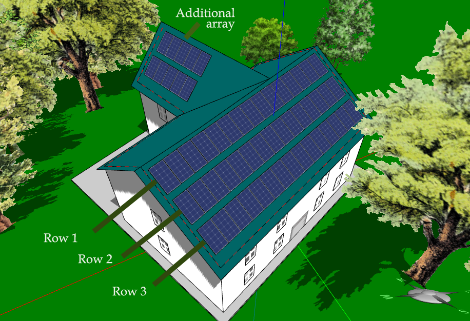
Fig. 1 3D model of a real house near Boston (2,150 sq ft).
On August 3, 2015, President Obama announced the Clean Power Plan – a landmark step in reducing carbon pollution from power plants that takes real action on climate change. Producing clean energy from rooftop solar panels can greatly mitigate the problems in current power generation. In the US, there are more than 130 million homes. These homes, along with commercial buildings, consume more than 40% of the total energy of the country. With improving generation and storage technologies, a large portion of that usage could be generated by home buildings themselves.

A practical question is: How do we estimate the energy that a house can potentially generate if we put solar panels on top of it? This estimate is key to convincing homeowners to install solar panels or the bank to finance it. You wouldn't buy something without knowing its exact benefits, would you? This is why solar analysis and evaluation are so important to the solar energy industry.

The problem is: Every building is different! The location, the orientation, the landscape, the shape, the roof pitch, and so on, vary from one building to another. And there are over 100 MILLION of them around the country! To make the matter even more complicated, we are talking about annual gains, which require the solar analyst to consider solar radiation and landscape changes in four seasons. With all these complexities, no one can really design the layout of solar panels and calculate their outputs without using a 3D simulation tool.

There may be solar design and prediction software from companies like Autodesk. But for three reasons, we believe that our Energy3D CAD software will be a relevant tool in this marketplace. First, our goal is to enable everyone to use Energy3D without having to go through the level of training that most engineers must go through with other CAD tools in order to master them. Second, Energy3D is completely free of charge to everyone. Third, the accuracy of Energy3D's solar analysis is comparable with that of others (and is improving as we speak!).

With these advantages, it is now possible for homeowners to evaluate the solar potential of their houses INDEPENDENTLY, using an incredibly powerful scientific simulation tool that has been designed for the layperson.

In this post, I will walk you through the solar design process in Energy3D step by step.

1) Sketch up a 3D model of your house

Energy3D has an easy-to-use interface for quickly constructing your house in a 3D environment. With this interface, you can create an approximate 3D model of your house without having to worry about details such as interiors that are not important to solar analysis. Improvements of this user interface are on the way. For example, we just added a handy feature that allows users to copy and paste in 3D space. This new feature can be used to quickly create an array of solar panels by simply copying a panel and hitting Ctrl/Command+V a few times. As trees are important to the performance of your solar panels, you should also model the surrounding trees by adding various tree objects in Energy3D. Figure 1 shows a 3D model of a real house in Massachusetts, surrounded by trees. Notice that this house has a T shape and its longest side faces southeast, which means that other sides of its roof may worth checking.
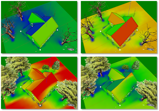
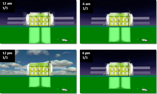
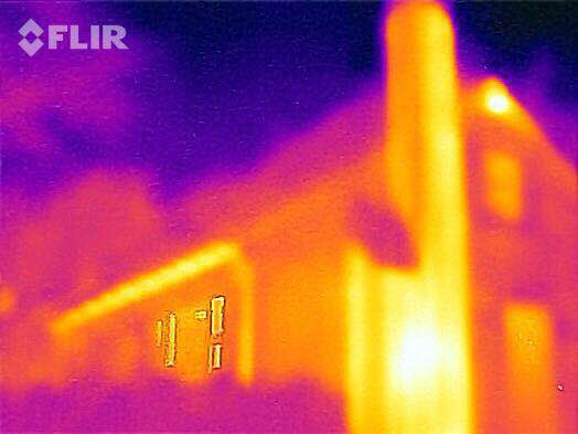
Fig. 2 Daily solar radiation in four seasons

2) Examine the solar radiation on the roof in four seasons

Once you have a 3D model of your house and the surrounding trees, you should take a look at the solar radiation on the roof throughout the year. To do this, you have to change the date and run a solar simulation for each date. For example, Figure 2 shows the solar radiation heat maps of the Massachusetts house on 1/1, 4/1, 7/1, and 10/1, respectively. Note that the trees do not have leaves from the beginning of December to the end of April (approximately), meaning that their impacts to the performance of the solar panels are minimal in the winter.

The conventional wisdom is that the south-facing side of the roof is a good place to put solar panels. But very few houses face exact south. This is why we need a simulation tool to analyze real situations. By looking at the color maps in Figure 2, we can quickly figure out that the southeast-facing side of the roof of this house is the optimal side for solar panels and we also know that the lower part of this side is shadowed significantly by the surrounding trees.

Fig. 3 Solarizing the house
3) Add, copy, and paste solar panels to create arrays

Having decided which side to lay the solar panels, the next step is to add them to it. You can drop them one by one. Or drop the first one near an edge and then copy and paste it to easily create an array. Repeat this for three rows as illustrated in Figure 3. Note that I chose the solar panels that have a light-electricity conversion efficiency of 15%, which is about average in the current market. New panels may come with higher efficiency.

The three rows have a total number of 45 solar panels (3 x 5 feet each). From Figure 2, it also seems the T-wing roof leaning towards west may be a sub-optimal place to go solar. Let's also put a 2x5 array of panels on that side. If the simulation shows that they do not worth the money, we can just delete them from the model. This is the power of the simulation -- you do not have to pay a penny for anything you do with a virtual house (and you do not have to wait for a year to evaluate the effect of anything you do on its yearly energy usage).

4) Run annual energy analysis for the building

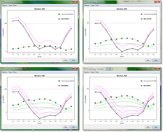
Fig. 4 Energy graphs with added solar panels
Now that we have put up the solar panels, we want to know how much energy they can produce. In Energy3D, this is as simple as selecting "Run Annual Energy Analysis for Building..." under the Analysis Menu. A graph will display the progress while Energy3D automatically performs a 12-month simulation and updates the results (Figure 4).

I recommend that you run this analysis every time you add a row of solar panels to keep track of the gains from each additional row. For example, Figure 4 shows the changes of solar outputs each time we add a row (the last one is the 10 panels added to the west-facing side of the T-wing roof). The following lists the annual results:
  • Row 1, 15 panels, output: 5,414 kWh --- 361 kWh/panel
  • Row 2, 15 panels, output: 5,018 kWh (total: 10,494 kWh) --- 335 kWh/panel
  • Row 3, 15 panels, output: 4,437 kWh (total: 14,931 kWh) --- 296 kWh/panel
  • T-wing 2x5 array, 10 panels, output: 2,805 kWh (total: 17,736 kWh) --- 281 kWh/panel
These results suggest that 30 panels in Rows 1 and 2 are probably a good solution for this house -- they generate a total of 10,494 kWh in a year. But if we have better (i.e., high efficiency) and cheaper solar panels in the future, adding panels to Row 3 and the T-wing may not be such a bad idea.

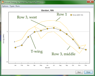
Fig. 5 Comparing solar panels at different positions
5) Compare the solar gains of panels at different positions

In addition to analyze the energy performance of the entire house, Energy3D also allows you to select individual elements and compare their performances. Figure 5 shows the comparison of four solar panels at different positions. The graph shows that the middle positions in Row 3 are not good spots for solar panels. Based on this information, we can go back to remove those solar panels and redo the analysis to see if we will have a better average output of Row 3.

After removing the five solar panels in the middle of Row 3, the total output drops to 16,335 kWh, meaning that the five panels on average output 280 kWh each.

6) Decide which positions are acceptable for installing solar panels

The analysis results thus far should provide you enough information with regard to whether it worth your money to solarize this house and, if yes, how to solarize it. The real decision depends on the cost of electricity in your area, your budget, and your expectation of the return of investment. With the price of solar panel continuing to drop, the quality continues to improve, and the pressure to reduce fossil energy usage continues to increase, building solarization is becoming more and more viable.

Solar analysis using computational tools is typically considered as the job of a professional engineer as it involves complicated computer-based design and analysis. The high cost of a professional engineer makes analyzing and evaluating millions of buildings economically unfavorable. But Energy3D reduces this task to something that even children can do. This could lead to a paradigm shift in the solar industry that will fundamentally change the way residential and commercial solar evaluation is conducted. We are very excited about this prospect and are eager to with the energy industry to ignite this revolution.

Monday, October 12, 2015

Daily energy analysis in Energy3D

Fig. 1: The analyzed house.
Energy3D already provides a set of powerful analysis tools that users can use to analyze the annual energy performance of their designs. For experts, the annual analysis tools are convenient as they can quickly evaluate their designs based on the results. For novices who are trying to understand how the energy graphs are calculated (or skeptics who are not sure whether they should trust the results), the annual analysis is sometimes a bit like a black box. This is because if there are too many variables (which, in this case, are seasonal changes of solar radiation and weather) to deal with at once, we will be overwhelmed. The total energy data are the results of two astronomic cycles: the daily cycle (caused by the spin of the Earth itself) and the annual cycle (caused by the rotation of the Earth around the Sun). This is why novices have a hard time reasoning with the results.

Fig. 2: Daily light sensor data in four seasons.
To help users reduce one layer of complexity and make sense of the energy data calculated in Energy3D simulations, a new class of daily analysis tools has been added to Energy3D. These tools allow users to pick a day to do the energy analyses, limiting the graphs to the daily cycle.

For example, we can place three sensors on the east, south, and west sides of the house shown in Figure 1. Then we can pick four days -- January 1st, April 1st, July 1st, and October 1st -- to represent the four seasons. Then we run a simulation for each day to collect the corresponding sensor data. The results are shown in Figure 2. These show that in the winter, the south-facing side receives the highest intensity of solar radiation, compared with the east and west-facing sides. In the summer, however, it is the east and west-facing sides that receive the highest intensity of solar radiation. In the spring and fall, the peak intensities of the three sides are comparable but they peak at different times.

Fig. 3: Daily energy use and production in four seasons.
If you take a more careful look at Figure 2, you will notice that, while the radiation intensity on the south-facing side always peaks at noon, those on the east and west-facing sides generally go through a seasonal shift. In the summer, the peak of radiation intensity occurs around 8 am on the east-facing side and around 4 pm on the west-facing side, respectively. In the winter, these peaks occur around 9 am and 2 pm, respectively. This difference is due to the shorter day in the winter and the lower position of the Sun in the sky.

Energy3D also provides a heliodon to visualize the solar path on any given day, which you can use to examine the angle of the sun and the length of the day. If you want to visually evaluate solar radiation on a site, it is best to combine the sensor and the heliodon.

You can also analyze the daily energy use and production. Figure 3 shows the results. Since this house has a lot of south-facing windows that have a Solar Heat Gain Coefficient of 80%, the solar energy is actually enough to keep the house warm (you may notice that your heater runs less frequently in the middle of a sunny winter day if you have a large south-facing window). But the downside is that it also requires a lot of energy to cool the house in the summer. Also note the interesting energy pattern for July 1st -- there are two smaller peaks of solar radiation in the morning and afternoon. Why? I will leave that answer to you.

Saturday, October 10, 2015

Energy3D in Colombia

Camilo Vieira Mejia, a PhD student of Purdue University, recently brought our Energy3D software to a workshop, which is a part of Clubes de Ciencia -- an initiative where graduate students go to Colombia and share science and engineering concepts with high school students from small towns around Antioquia (a state of Colombia).

Students designed houses with Energy3D, printed them out, assemble them, and put them under the Sun to test their solar gains. They probably have also run the solar and thermal analyses for their virtual houses.

We are glad that our free software is reaching out to students in these rural areas and helping them to become interested in science and engineering. This is one of the many examples that a project funded by the National Science Foundation also turns out to benefit people in other countries and impact the world in many positive ways. In this sense, the National Science Foundation is not just a federal agency -- it is a global agency.

If you are also using Energy3D in your country, please consider contacting us and sharing your stories or thoughts.

Energy3D is intended to be global -- It currently includes weather data from 220 locations in all the continents. Please let us know you would like to include locations in your country in the software so that you can design energy solutions for your own area. As a matter of fact, this was exactly what Camilo asked me to do before he headed for Colombia. I would have had no clue which towns in Colombia should be added and where I could retrieve their weather data (which is often in a foreign language).

[With the kind permission of these participating students, we are able to release the photos in this blog post.]

Friday, October 9, 2015

Geothermal simulation in Energy3D


Fig.1: Annual air and ground temperatures (daily averages)
A building exchanges heat not only with the outside air but also with the ground. The ground temperature depends on the location and the depth. At six meters under and deeper, the temperature remains almost constant throughout the year. That constant temperature roughly equals to the mean annual air temperature, which depends on the latitude.
Fig.2: Daily air and ground temperatures on 7/1

The ground temperature has a variation pattern different from that of the air temperature. You may experience this difference when you walk into the basement of a house from the outside in the summer or in the winter at different times of the day.

For our Energy3D CAD software to account for the heat transfer between a building and the ground at any time of a year at the 220 worldwide locations that it currently supports, we must develop a physical model for geothermal energy. While there is an abundance of weather data, we found very little ground data (ground data are, understandably, more difficult and expensive to collect). In the absence of real-world data, we have to rely on mathematical modeling.

Fig.3: Daily air and ground temperatures on 1/1
This mission was accomplished in Version 4.9.3 of Energy3D, which can now simulate the heat transfer with the ground. This geothermal model also opens up the possibility to simulate ground source heat pumps -- a promising clean energy solution, in Energy3D (which aims to ultimately include various renewable energy sources in its design capacity to support energy engineering).

Exactly how the math works can be found in the User Guide. In this blog post, I will show you some results. Figure 1 shows the daily averages of the air and ground temperatures throughout the year in Boston, MA. There are two notable features of this graph: 1) Going more deeply, the temperature fluctuation decreases and eventually diminishes at six meters; and 2) the peaks of the ground temperatures lag behind that of the air temperature, due to the heat capacity of the ground (the ground absorbs a lot of thermal energy in the summer and slowly releases them as the air cools in the fall).

Fig. 4: Four snapshots of heat transfer with the ground on a cold day.
In addition to the annual trend, users can also examine the daily fluctuations of the ground temperatures at different depths. Figure 2 shows the results on July, 1. There are three notable features of this graph: 1) Overall the ground temperature decreases when we go deeper; 2) the daily fluctuation of the ground temperature decreases when we go deeper; and 3) the peaks of the ground temperatures lag behind the peak of air temperature. Figure 3 shows the results on January 1 with a similar trend, except that the ground temperatures are higher than the air temperature.

Figure 4 shows four snapshots of the heat transfer between a house and the ground at four different times (12 am, 6 am, 12 pm, and 6 pm) on January 1. The figure shows arrays of heat flux vectors that represent the direction and magnitude of heat flow. To exaggerate the visualization, the R-values of the floor insulation and the windows were deliberately set to be low. If you observe carefully, you will find that the change in the magnitude of the heat flux vectors into the ground lags behind that of those into the air.

The geothermal model also includes parameters that allow users to choose the physical properties of the ground, such as thermal diffusivity. For example, Dry land tends to have smaller thermal diffusivity than wet land. With these properties, geology also becomes a design factor, making the already interdisciplinary Energy3D software even more so.

Sunday, September 13, 2015

Simulating the Hadley Cell using Energy2D

Download the models
Although it is mostly used as an engineering tool, our Energy2D software can also be used to create simple Earth science simulations. This blog post shows some interesting results about the Hadley Cell.

The Hadley Cell is an atmospheric circulation that transports energy and moisture from the equator to higher latitudes in the northern and southern hemispheres. This circulation is intimately related to the trade winds, hurricanes, and the jet streams.

As a simple way to simulate zones of ocean that have different temperatures due to differences in solar heating, I added an array of constant-temperature objects at the bottom of the simulation window. The temperature gradually decreases from 30 °C in the middle to 15 °C at the edges. A rectangle, set to be at a constant temperature of -20 °C, is used to mimic the high, chilly part of the atmosphere. The viscosity of air is deliberately set to much higher than reality to suppress the wild fluctuations for a somehow averaged effect. The results show a stable flow pattern that looks like a cross section of the Hadley Cell, as is shown in the first image of this post.

When I increased the buoyant force of the air, an oscillatory pattern was produced. The system swings between two states shown in the second and third images, indicating a periodic reinforcement of hot rising air from the adjacent areas to the center (which is supposed to represent the equator).

Of course, I can't guarantee that the results produced by Energy2D are what happen in nature. Geophysical modeling is an extremely complicated business with numerous factors that are not considered in this simple model. Yet, Energy2D shows something interesting: the fluctuations of wind speeds seem to suggest that, even without considering the seasonal changes, this nonlinear model already exhibits some kind of periodicity. We know that it is all kinds of periodicity in Mother Nature that help to sustain life on the Earth.

Wednesday, September 9, 2015

Simulating geometric thermal bridges using Energy2D

Fig. 1: IR image of a wall junction (inside) by Stefan Mayer
One of the mysterious things that causes people to scratch their heads when they see an infrared picture of a room is that the junctions such as edges and corners formed by two exterior walls (or floors and roofs) often appear to be colder in the winter than other parts of the walls, as is shown in Figure 1. This is, I hear you saying, caused by an air gap between two walls. But not that simple! While a leaking gap can certainly do it, the effect is there even without a gap. Better insulation only makes the junctions less cold.

Fig. 2: An Energy2D simulation of thermal bridge corners.
A typical explanation of this phenomenon is that, because the exterior surface of a junction (where the heat is lost to the outside) is greater than its interior surface (where the heat is gained from the inside), the junction ends up losing thermal energy in the winter more quickly than a straight part of the walls, causing it to be colder. The temperature difference is immediately revealed by a very sensitive IR camera. Such a junction is commonly called a geometric thermal bridge, which is different from material thermal bridge that is caused by the presence of a more conductive piece in a building assembly such as a steel stud in a wall or a concrete floor of a balcony.

Fig. 3: IR image of a wall junction (outside) by Stefan Mayer
But the actual heat transfer process is much more complicated and confusing. While a wall junction does create a difference in the surface areas of the interior and exterior of the wall, it also forms a thicker area through which the heat must flow through (the area is thicker because it is in a diagonal direction). The increased thickness should impede the heat flow, right?

Fig. 4: An Energy2D simulation of a L-shaped wall.
Unclear about the outcome of these competing factors, I made some Energy2D simulations to see if they can help me. Figure 2 shows the first one that uses a block of object remaining at 20 °C to mimic a warm room and the surrounding environment of 0 °C, with a four-side wall in-between. Temperature sensors are placed at corners, as well as the middle point of a wall. The results show that the corners are indeed colder than other parts of the walls in a stable state. (Note that this simulation only involves heat diffusion, but adding radiation heat transfer should yield similar results.)

What about more complex shapes like an L-shaped wall that has both convex and concave junctions? Figure 3 shows the IR image of such a wall junction, taken from the outside of a house. In this image, interestingly enough, the convex edge appears to be colder, but the concave edge appears to be warmer!

The Energy2D simulation (Figure 4) shows a similar pattern like the IR image (Figure 3). The simulation results show that the temperature sensor placed near the concave edge outside the L-shape room does register a higher temperature than other sensors.

Now, the interesting question is, does the room lose more energy through a concave junction or a convex one? If we look at the IR image of the interior taken inside the house (Figure 1), we would probably say that the convex junction loses more energy. But if we look at the IR image of the exterior taken outside the house (Figure 3), we would probably say that the concave junction loses more energy.

Which statement is correct? I will leave that to you. You can download the Energy2D simulations from this link, play with them, and see if they help you figure out the answer. These simulations also include simulations of the reverse cases in which heat flows from the outside into the room (the summer condition).

Sunday, August 23, 2015

Time series analysis tools in Visual Process Analytics: Cross correlation

Two time series and their cross-correlation functions
In a previous post, I showed you what autocorrelation function (ACF) is and how it can be used to detect temporal patterns in student data. The ACF is the correlation of a signal with itself. We are certainly interested in exploring the correlations among different signals.

The cross-correlation function (CCF) is a measure of similarity of two time series as a function of the lag of one relative to the other. The CCF can be imagined as a procedure of overlaying two series printed on transparency films and sliding them horizontally to find possible correlations. For this reason, it is also known as a "sliding dot product."

The upper graph in the figure to the right shows two time series from a student's engineering design process, representing about 45 minutes of her construction (white line) and analysis (green line) activities while trying to design an energy-efficient house with the goal to cut down the net energy consumption to zero. At first glance, you probably have no clue about what these lines represent and how they may be related.

But their CCFs reveal something that appears to be more outstanding. The lower graph shows two curves that peak at some points. I know you have a lot of questions at this point. Let me try to see if I can provide more explanations below.

Why are there two curves for depicting the correlation of two time series, say, A and B? This is because there is a difference between "A relative to B" and "B relative to A." Imagine that you print the series on two transparency films and slide one on top of the other. Which one is on the top matters. If you are looking for cause-effect relationships using the CCF, you can treat the antecedent time series as the cause and the subsequent time series as the effect.

What does a peak in the CCF mean, anyways? It guides you to where more interesting things may lie. In the figure of this post, the construction activities of this particular student were significantly followed by analysis activities about four times (two of them are within 10 minutes), but the analysis activities were significantly followed by construction activities only once (after 10 minutes).

Thursday, August 20, 2015

Time series analysis tools in Visual Process Analytics: Autocorrelation

Autocorrelation reveals a three-minute periodicity
Digital learning tools such as computer games and CAD software emit a lot of temporal data about what students do when they are deeply engaged in the learning tools. Analyzing these data may shed light on whether students learned, what they learned, and how they learned. In many cases, however, these data look so messy that many people are skeptical about their meaning. As optimists, we believe that there are likely learning signals buried in these noisy data. We just need to use or invent some mathematical tricks to figure them out.

In Version 0.2 of our Visual Process Analytics (VPA), I added a few techniques that can be used to do time series analysis so that researchers can find ways to characterize a learning process from different perspectives. Before I show you these visual analysis tools, be aware that the purpose of these tools is to reveal the temporal trends of a given process so that we can better describe the behavior of the student at that time. Whether these traits are "good" or "bad" for learning likely depends on the context, which often necessitates the analysis of other co-variables.

Correlograms reveal similarity of two time series.
The first tool for time series analysis added to VPA is the autocorrelation function (ACF), a mathematical tool for finding repeating patterns obscured by noise in the data. The shape of the ACF graph, called the correlogram, is often more revealing than just looking at the shape of the raw time series graph. In the extreme case when the process is completely random (i.e., white noise), the ACF will be a Dirac delta function that peaks at zero time lag. In the extreme case when the process is completely sinusoidal, the ACF will be similar to a damped oscillatory cosine wave with a vanishing tail.

An interesting question relevant to learning science is whether the process is autoregressive (or under what conditions the process can be autoregressive). The quality of being autoregressive means that the current value of a variable is influenced by its previous values. This could be used to evaluate whether the student learned from the past experience -- in the case of engineering design, whether the student's design action was informed by previous actions. Learning becomes more predictable if the process is autoregressive (just to be careful, note that I am not saying that more predictable learning is necessarily better learning). Different autoregression models, denoted as AR(n) with n indicating the memory length, may be characterized by their ACFs. For example, the ACF of AR(2) decays more slowly than that of AR(1), as AR(2) depends on more previous points. (In practice, partial autocorrelation function, or PACF, is often used to detect the order of an AR model.)

The two figures in this post show that the ACF in action within VPA, revealing temporal periodicity and similarity in students' action data that are otherwise obscure. The upper graphs of the figures plot the original time series for comparison.

Monday, July 27, 2015

Visual Process Analytics (VPA) launched


Visual Process Analytics (VPA) is an online analytical processing (OLAP) program that we are developing for visualizing and analyzing student learning from complex, fine-grained process data collected by interactive learning software such as computer-aided design tools. We envision a future in which every classroom would be powered by informatics and infographics such as VPA to support day-to-day learning and teaching at a highly responsive level. In a future when every business person relies on visual analytics every day to stay in business, it would be a shame that teachers still have to read through tons of paper-based work from students to make instructional decisions. The research we are conducting with the support of the National Science Foundation is paving the road to a future that would provide the fair support for our educational systems that is somehow equivalent to business analytics and intelligence.

This is the mission of VPA. Today we are announcing the launch of this cyberinfrastructure. We decided that its first version number should be 0.1. This is just a way to indicate that the research and development on this software system will continue as a very long-term effort and what we have done is a very small step towards a very ambitious goal.


VPA is written in plain JavaScript/HTML/CSS. It should run within most browsers -- best on Chrome and Firefox -- but it looks and works like a typical desktop app. This means that while you are in the middle of mining the data, you can save what we call "the perspective" as a file onto your disk (or in the cloud) so that you can keep track of what you have done. Later, you can load the perspective back into VPA. Each perspective opens the datasets that you have worked on, with your latest settings and results. So if you are half way through your data mining, your work can be saved for further analyses.

So far Version 0.1 has seven analysis and visualization tools, each of which shows a unique aspect of the learning process with a unique type of interactive visualization. We admit that, compared with the daunting high dimension of complex learning, this is a tiny collection. But we will be adding more and more tools as we go. At this point, only one repository -- our own Energy3D process data -- is connected to VPA. But we expect to add more repositories in the future. Meanwhile, more computational tools will be added to support in-depth analyses of the data. This will require a tremendous effort in designing a smart user interface to support various computational tasks that researchers may be interested in defining.

Eventually, we hope that VPA will grow into a versatile platform of data analytics for cutting-edge educational research. As such, VPA represents a critically important step towards marrying learning science with data science and computational science.

Friday, July 24, 2015

The National Science Foundation funds large-scale applications of infrared cameras in schools


We are pleased to announce that the National Science Foundation has awarded the Concord Consortium, Next Step Living, and Virtual High School a grant of $1.2M to put innovative technologies such as infrared cameras into the hands of thousands of secondary students. This education-industry collaborative will create a technology-enhanced learning pathway from school to home and then to cognate careers, establishing thereby a data-rich testbed for developing and evaluating strategies for translating innovative technology experiences into consistent science learning and career awareness in different settings. While there have been studies on connecting science to everyday life or situating learning in professional scenarios to increase the relevance or authenticity of learning, the strategies of using industry-grade technologies to strengthen these connections have rarely been explored. In many cases, often due to the lack of experiences, resources, and curricular supports, industry technologies are simply used as showcases or demonstrations to give students a glimpse of how professionals use them to solve problems in the workplace.


Over the last few years, however, quite a number of industry technologies have become widely accessible to schools. For example, Autodesk has announced that their software products will be freely available to all students and teachers around the world. Another example is infrared cameras that I have been experimenting and blogging since 2010. Due to the continuous development of electronics and optics, what used to be a very expensive scientific instrument is now only a few hundred dollars, with the most affordable infrared camera falling below $200.

The funded project, called Next Step Learning, will be the largest-scale application of infrared camera in secondary schools -- in terms of the number of students that will be involved in the three-year project. We estimate that dozens of schools and thousands of students in Massachusetts will participate in this project. These students will use infrared cameras provided by the project to thermally inspect their own homes. The images in this blog post are some of the curious images I took in my own house using the FLIR ONE camera that is attached to an iPhone.

In the broader context, the Next Generation Science Standards (NGSS) envisions “three-dimensional learning” in which the learning of disciplinary core ideas and crosscutting concepts is integrated with science and engineering practices. A goal of the NGSS is to make science education more closely resemble the way scientists and engineers actually think and work. To accomplish this goal, an abundance of opportunities for students to practice science and engineering through solving authentic real-world problems will need to be created and researched. If these learning opportunities are meaningfully connected to current industry practices using industry-grade technologies, they can also increase students’ awareness of cognate careers, help them construct professional identities, and prepare them with knowledge and skills needed by employers, attaining thereby the goals of both science education and workforce development simultaneously. The Next Step Learning project will explore, test, and evaluate this strategy.

Wednesday, July 22, 2015

Twelve Energy3D designs by Cormac Paterson

Cormac Paterson, a 17-years old student from Arlington High School in Massachusetts, has created yet another set of beautiful architectural designs using our Energy3D CAD software. The variety of his designs can be used to gauge the versatility of the software. His work is helping us push the boundary of the software and imagine what may be possible with the system.

This is the second year Cormac has worked with us as a summer intern. We are constantly impressed by his perseverance in working with the limitations of the software and around problems, as well as his ingenuity in coming up with new solutions and ideas. Working with Cormac has inspired us on how to improve our software so that it can support more students to do this kind of creative design. Our objective in the long run is to develop our software into a CAD system that is appropriate for children and yet capable of supporting authentic engineering design. Cormac's work might be an encouraging sign that we may actually be very close to realizing this goal.

Cormac also designed a building surrounded by solar trees. Solar tree is a concept that blends art and solar energy technology in a sculptural expression. An image of this post shows the result of the solar energy gains of these "trees" using the improved computational engine for solar simulation in Energy3D. 

Tuesday, June 23, 2015

Seeing student learning with visual analytics

Technology allows us to record almost everything happening in the classroom. The fact that students' interactions with learning environments can be logged in every detail raises the interesting question about whether or not there is any significant meaning and value in those data and how we can make use of them to help students and teachers, as pointed out in a report sponsored by the U.S. Department of Education:
New technologies thus bring the potential of transforming education from a data-poor to a data-rich enterprise. Yet while an abundance of data is an advantage, it is not a solution. Data do not interpret themselves and are often confusing — but data can provide evidence for making sound decisions when thoughtfully analyzed.” — Expanding Evidence Approaches for Learning in a Digital World, Office of Educational Technology, U.S. Department of Education, 2013
A radar chart of design space exploration.
A histogram of action intensity.
Here we are not talking about just analyzing students' answers to some multiple-choice questions, or their scores in quizzes and tests, or their frequencies of logging into a learning management system. We are talking about something much more fundamental, something that runs deep in cognition and learning, such as how students conduct a scientific experiment, solve a problem, or design a product. As learning goes deeper in those directions, data produced by students grows bigger. It is by no means an easy task to analyze large volumes of learner data, which contain a lot of noisy elements that cast uncertainty to assessment. The validity of an assessment inference rests on  the strength of evidence. Evidence construction often relies on the search for relations, patterns, and trends in student data.With a lot of data, this mandates some sophisticated computation similar to cognitive computing.

Data gathered from highly open-ended inquiry and design activities, key to authentic science and engineering practices that we want students to learn, are often intensive and “messy.” Without analytic tools that can discern systematic learning from random walk, what is provided to researchers and teachers is nothing but a DRIP (“data rich, information poor”) problem.

A scatter plot of action timeline.
Recognizing the difficulty in analyzing the sheer volume of messy student data, we turned to visual analytics, a whole category of techniques extensively used in cutting-edge business intelligence systems such as software developed by SAS, IBM, and others. We see interactive, visual process analytics key to accelerating the analysis procedures so that researchers can adjust mining rules easily, view results rapidly, and identify patterns clearly. This kind of visual analytics optimally combines the computational power of the computer, the graphical user interface of the software, and the pattern recognition power of the brain to support complex data analyses in data-intensive educational research.

A digraph of action transition.
So far, I have written four interactive graphs and charts that can be used to study four different aspects of the design action data that we collected from our Energy3D CAD software. Recording several weeks of student work on complex engineering design challenges, these datasets are high-dimensional, meaning that it is improper to treat them from a single point of view. For each question we are interested in getting answers from student data, we usually need a different representation to capture the outstanding features specific to the question. In many cases, multiple representations are needed to address a question.

In the long run, our objective is to add as many graphic representations as possible as we move along in answering more and more research questions based on our datasets. Given time, this growing library of visual analytics would develop sufficient power to the point that it may also become useful for teachers to monitor their students' work and thereby conduct formative assessment. To guarantee that our visual analytics runs on all devices, this library is written in JavaScript/HTML/CSS. A number of touch gestures are also supported for users to use the library on a multi-touch screen. A neat feature of this library is that multiple graphs and charts can be grouped together so that when you are interacting with one of them, the linked ones also change at the same time. As the datasets are temporal in nature, you can also animate these graphs to reconstruct and track exactly what students do throughout.

Monday, June 8, 2015

The National Science Foundation funds SmartCAD—an intelligent learning system for engineering design

We are pleased to announce that the National Science Foundation has awarded the Concord Consortium, Purdue University, and the University of Virginia a $3 million, four-year collaborative project to conduct research and development on SmartCAD, an intelligent learning system that informs engineering design of students with automatic feedback generated using computational analysis of their work.

Engineering design is one of the most complex learning processes because it builds on top of multiple layers of inquiry, involves creating products that meet multiple criteria and constraints, and requires the orchestration of mathematical thinking, scientific reasoning, systems thinking, and sometimes, computational thinking. Teaching and learning engineering design becomes important as it is now officially part of the Next Generation Science Standards in the United States. These new standards mandate every student to learn and practice engineering design in every science subject at every level of K-12 education.
Figure 1

In typical engineering projects, students are challenged to construct an artifact that performs specified functions under constraints. What makes engineering design different from other design practices such as art design is that engineering design must be guided by scientific principles and the end products must operate predictably based on science. A common problem observed in students' engineering design activities is that their design work is insufficiently informed by science, resulting in the reduction of engineering design to drawing or crafting. To circumvent this problem, engineering design curricula often encourage students to learn or review the related science concepts and practices before they try to put the design elements together to construct a product. After students create a prototype, they then test and evaluate it using the governing scientific principles, which, in turn, gives them a chance to deepen their understanding of the scientific principles. This common approach of learning is illustrated in the upper image of Figure 1.

There is a problem in the common approach, however. Exploring the form-function relationship is a critical inquiry step to understanding the underlying science. To determine whether a change of form can result in a desired function, students have to build and test a physical prototype or rely on the opinions of an instructor. This creates a delay in getting feedback at the most critical stage of the learning process, slowing down the iterative cycle of design and cutting short the exploration in the design space. As a result of this delay, experimenting and evaluating "micro ideas"--very small stepwise ideas such as those that investigate a design parameter at a time--through building, revising, and testing physical prototypes becomes impractical in many cases. From the perspective of learning, however, it is often at this level of granularity that foundational science and engineering design ultimately meet.

Figure 2
All these problems can be addressed by supporting engineering design with a computer-aided design (CAD) platform that embeds powerful science simulations to provide formative feedback to students in a timely manner. Simulations based on solving fundamental equations in science such as Newton’s Laws model the real world accurately and connect many science concepts coherently. Such simulations can computationally generate objective feedback about a design, allowing students to rapidly test a design idea on a scientific basis. Such simulations also allow the connections between design elements and science concepts to be explicitly established through fine-grained feedback, supporting students to make informed design decisions for each design element one at a time, as illustrated by the lower image of Figure 1. These scientific simulations give the CAD software tremendous disciplinary intelligence and instructional power, transforming it into a SmartCAD system that is capable of guiding student design towards a more scientific end.

Despite these advantages, there are very few developmentally appropriate CAD software available to K-12 students—most CAD software used in industry not only are science “black boxes” to students, but also require a cumbersome tool chaining of pre-processors, solvers, and post-processors, making them extremely challenging to use in secondary education. The SmartCAD project will fill in this gap with key educational features centered on guiding student design with feedback composed from simulations. For example, science simulations can be used to analyze student design artifacts and compute their distances to specific goals to detect whether students are zeroing in towards those goals or going astray. The development of these features will also draw upon decades of research on formative assessments of complex learning.

Thursday, May 21, 2015

Book review: "Simulation and Learning: A Model-Centered Approach" by Franco Landriscina

Interactive science (Image credit: Franco Landriscina)
If future historians were to write a book about the most important contributions of technology to improving science education, it would be hard for them to skip computer modeling and simulation.

Much of our intelligence as humans originates from our ability to run mental simulations or thought experiments in our mind to decide whether it would be a good idea to do something or not to do something. We are able to do this because we have already acquired some basic ideas or mental models that can be applied to new situations. But how do we get those ideas in the first place? Sometimes we learn from our experiences. Sometimes we learn from listening to someone. Now, we can learn from computer simulation, which was carefully programmed by someone who knows the subject matter well and is typically expressed by a computer through interactive visualization based on some sort of calculation. In the cases when the subject matter is entirely alien to students such as atoms and molecules, computer simulation is perhaps the most effective form of instruction. Given the importance of mental simulation in scientific reasoning, there is no doubt that computer simulation, bearing some similarity with mental simulation, should have great potential in fostering learning.

Constructive science (Image credit: Franco Landriscina)
Although enough ink has been spilled on this topic and many thoughts have existed in various forms for decades, I found the book "Simulation and Learning: A Model-Centered Approach" by Dr. Franco Landriscina, an experimental psychologist in Italy, is a masterpiece that I must have on my desk and chew over from time to time. What Dr. Landriscina has accomplished in a book less than 250 pages is amazingly deep and wide. He starts with fundamental questions in cognition and learning that are related to simulation-based instruction. He then gradually builds a solid theoretical foundation for understanding why computer simulation can help people learn and think by grounding cognition in the interplay between mental simulation (internal) and computer simulation (external). This intimate coupling of internalization and externalization leads to some insights as for how the effectiveness of computer simulation as an instructional tool can be maximized in various cases. For example, Landriscina's two illustrations, embedded in this blog post, represent how two ways of using simulations in learning, which I coined as "Interactive Science" and "Constructive Science," differ in terms of the relationships among the foundational components in cognition and simulation.

This book is not only useful to researchers. Developers should benefit from reading it, too. Developers tend to create educational tools and materials based on the learning goals set by some education standards, with less consideration on how complex learning actually happens through interaction and cognition in reality. This succinct book should provide a comprehensive, insightful, and intriguing guide for those developers who would like to understand more deeply about simulation-based learning in order to create more effective educational simulations.