Sunday, August 23, 2015

Time series analysis tools in Visual Process Analytics: Cross correlation

Two time series and their cross-correlation functions
In a previous post, I showed you what autocorrelation function (ACF) is and how it can be used to detect temporal patterns in student data. The ACF is the correlation of a signal with itself. We are certainly interested in exploring the correlations among different signals.

The cross-correlation function (CCF) is a measure of similarity of two time series as a function of the lag of one relative to the other. The CCF can be imagined as a procedure of overlaying two series printed on transparency films and sliding them horizontally to find possible correlations. For this reason, it is also known as a "sliding dot product."

The upper graph in the figure to the right shows two time series from a student's engineering design process, representing about 45 minutes of her construction (white line) and analysis (green line) activities while trying to design an energy-efficient house with the goal to cut down the net energy consumption to zero. At first glance, you probably have no clue about what these lines represent and how they may be related.

But their CCFs reveal something that appears to be more outstanding. The lower graph shows two curves that peak at some points. I know you have a lot of questions at this point. Let me try to see if I can provide more explanations below.

Why are there two curves for depicting the correlation of two time series, say, A and B? This is because there is a difference between "A relative to B" and "B relative to A." Imagine that you print the series on two transparency films and slide one on top of the other. Which one is on the top matters. If you are looking for cause-effect relationships using the CCF, you can treat the antecedent time series as the cause and the subsequent time series as the effect.

What does a peak in the CCF mean, anyways? It guides you to where more interesting things may lie. In the figure of this post, the construction activities of this particular student were significantly followed by analysis activities about four times (two of them are within 10 minutes), but the analysis activities were significantly followed by construction activities only once (after 10 minutes).
Thursday, August 20, 2015

Time series analysis tools in Visual Process Analytics: Autocorrelation

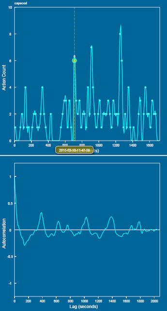
Autocorrelation reveals a three-minute periodicity
Digital learning tools such as computer games and CAD software emit a lot of temporal data about what students do when they are deeply engaged in the learning tools. Analyzing these data may shed light on whether students learned, what they learned, and how they learned. In many cases, however, these data look so messy that many people are skeptical about their meaning. As optimists, we believe that there are likely learning signals buried in these noisy data. We just need to use or invent some mathematical tricks to figure them out.

In Version 0.2 of our Visual Process Analytics (VPA), I added a few techniques that can be used to do time series analysis so that researchers can find ways to characterize a learning process from different perspectives. Before I show you these visual analysis tools, be aware that the purpose of these tools is to reveal the temporal trends of a given process so that we can better describe the behavior of the student at that time. Whether these traits are "good" or "bad" for learning likely depends on the context, which often necessitates the analysis of other co-variables.

Correlograms reveal similarity of two time series.
The first tool for time series analysis added to VPA is the autocorrelation function (ACF), a mathematical tool for finding repeating patterns obscured by noise in the data. The shape of the ACF graph, called the correlogram, is often more revealing than just looking at the shape of the raw time series graph. In the extreme case when the process is completely random (i.e., white noise), the ACF will be a Dirac delta function that peaks at zero time lag. In the extreme case when the process is completely sinusoidal, the ACF will be similar to a damped oscillatory cosine wave with a vanishing tail.

An interesting question relevant to learning science is whether the process is autoregressive (or under what conditions the process can be autoregressive). The quality of being autoregressive means that the current value of a variable is influenced by its previous values. This could be used to evaluate whether the student learned from the past experience -- in the case of engineering design, whether the student's design action was informed by previous actions. Learning becomes more predictable if the process is autoregressive (just to be careful, note that I am not saying that more predictable learning is necessarily better learning). Different autoregression models, denoted as AR(n) with n indicating the memory length, may be characterized by their ACFs. For example, the ACF of AR(2) decays more slowly than that of AR(1), as AR(2) depends on more previous points. (In practice, partial autocorrelation function, or PACF, is often used to detect the order of an AR model.)

The two figures in this post show that the ACF in action within VPA, revealing temporal periodicity and similarity in students' action data that are otherwise obscure. The upper graphs of the figures plot the original time series for comparison.